
95%
Task
Completion
after
Redesign
40%
Login
Abandonment
Dropped
98%
Positive
Survey
Feedback


Small Voices, Big Decisions
“When in doubt, talk to a real user; even if it’s only one.”
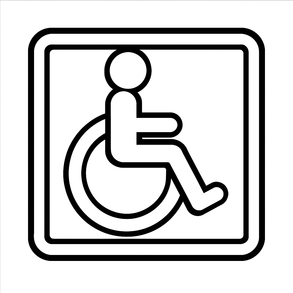
Accessibility in Action
Wireframe
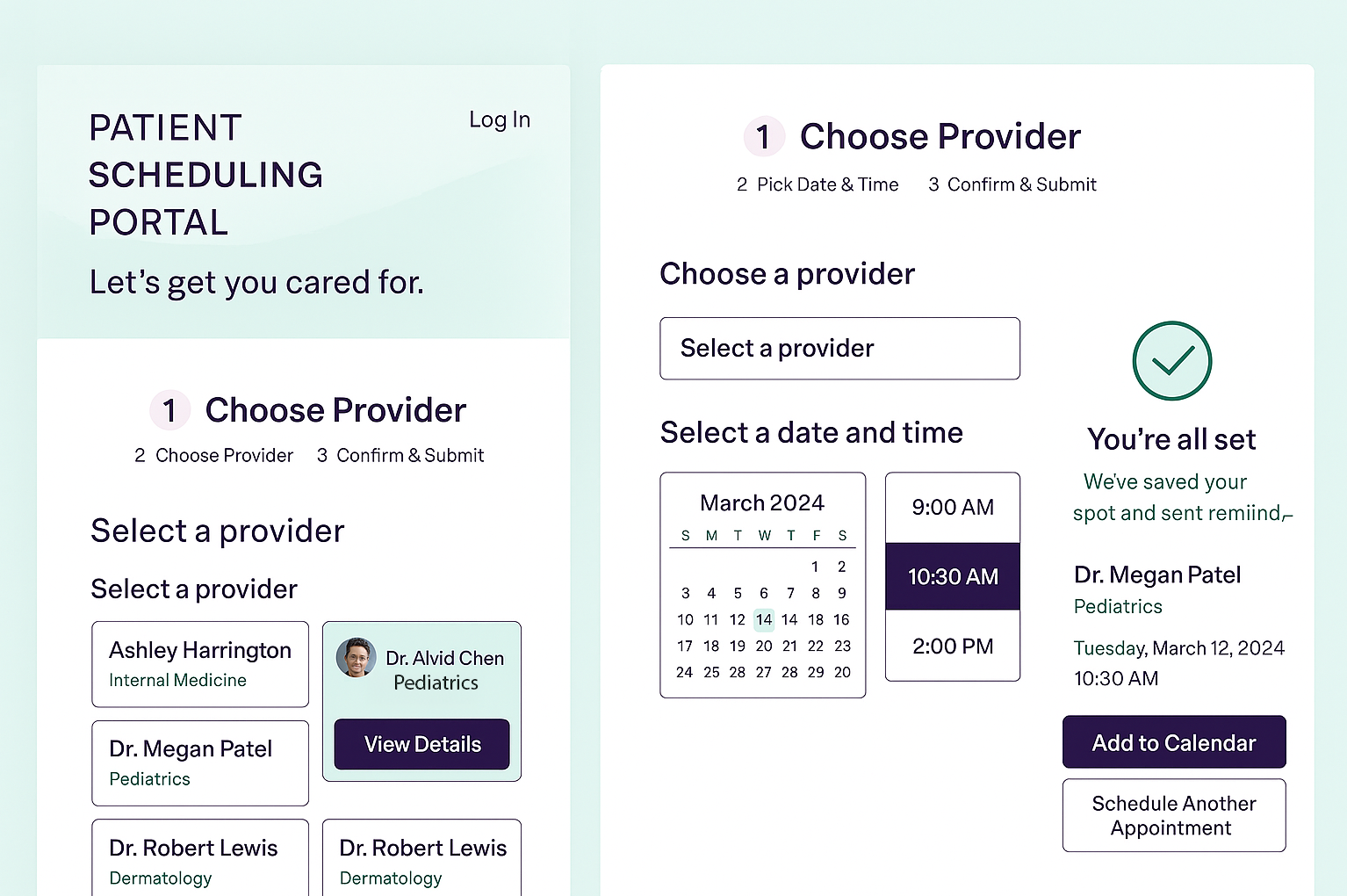
Resulting
Prototype

Hover Prototype
Designing an Inclusive
Healthcare Appointment System
I redesigned the appointment scheduling experience to be more intuitive and accessible for all patients.
Overview
The Human Spark
“She gave up at the login screen”
Challenge
- Cumbersome Scheduling System Navigation
- Lacked Screen Reader Support
- Confusing Time Selection
- Difficult for Older Adults to Navigate
Impact Snapshot

#Accessibility #Empathy First #Human Centered
- WCAG Improvements
- Rethought navigation
- Reduced cognitive load between steps
- Consistency matters - Harmonized colors
- The right details can soothe lined minds - Harmonized details
Impact Snapshot
95%
Task
Completion
after
Redesign
98%
Positive
Survey
Feedback
40%
Login
Abandonment
Dropped
Challenge
- Cumbersome Scheduling System Navigation
- Lacked Screen Reader Support
- Confusing Time Selection
- Difficult for Older Adults to Navigate
Small Voices, Big Decisions
“When in doubt, talk to a real user; even if it’s only one.”


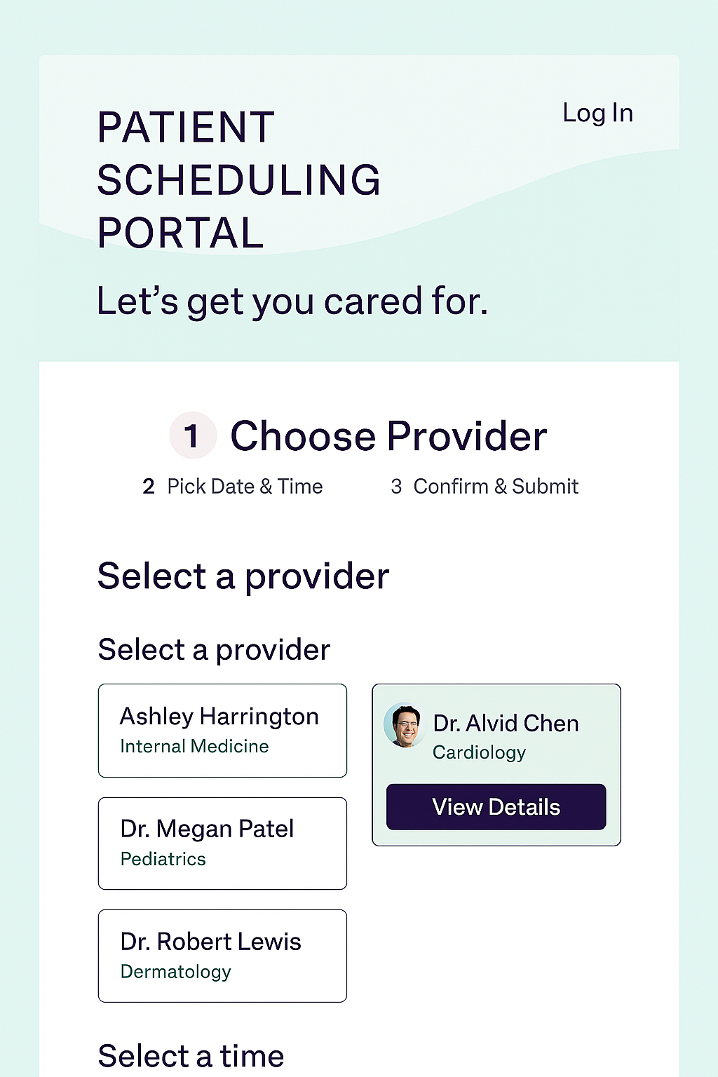
Wireframe
Hover
Prototype
Resulting
Prototype
I redesigned the appointment scheduling experience to be more intuitive and accessible for all patients.
Overview
#Accessibility #Empathy First #Human Centered
Designing an Inclusive
Healthcare Appointment System
Revitalizing Patient Access
- WCAG Improvements
- Rethought navigation
- Reduced cognitive load between steps
- Consistency matters - Harmonized colors
- The right details can soothe lined minds - Harmonized details
Accessibility in Action
The Human Spark
“She gave up at the
login screen”
Impact Snapshot
95%
Task Completion after Redesign
40%
Login
Abandonment
Dropped
98%
Positive
Survey
Feedback
Designing an Inclusive
Healthcare Appointment System
Revitalizing Patient Access


Overview
I redesigned the appointment scheduling experience to be more intuitive and accessible for all patients.
Challenge
- Cumbersome Scheduling System Navigation
- Lacked Screen Reader Support
- Confusing Time Selection
- Difficult for Older Adults to Navigate
Small Voices, Big Decisions
“When in doubt, talk to a real user; even if it’s only one.”


Wireframe
Hover
Prototype
Resulting Prototype
“She gave up at the
login screen”
The Human Spark
#Accessibility #Empathy First #Human Centered
- WCAG Improvements
- Rethought navigation
- Reduced cognitive load between steps
- Consistency matters - Harmonized colors
- The right details can soothe lined minds - Harmonized details
Accessibility in Action