
Dentist Patient Scheduler
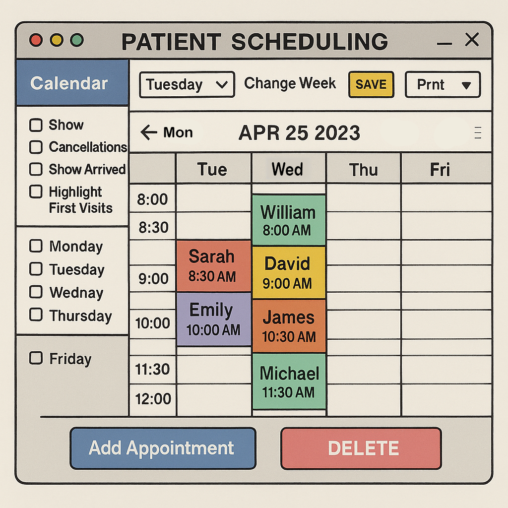
Problem
Dental offices often rely on outdated scheduling systems that are cluttered, unintuitive, and difficult to navigate.
The original interface suffered from:
- Overcrowded layout with minimal spacing
- Inconsistent color usage without clear meaning
- Redundant or confusing controls (e.g., “DELETE” in all caps)
- Lack of accessibility and visual hierarchy
These issues created friction for front-desk staff, increased the risk of booking errors, and made it harder to manage patient flow efficiently

Analysis
A heuristic evaluation and visual audit revealed several usability violations:
- Visibility of system status: No clear indication of selected filters or active days
- Match between system and real world: Abbreviations like “Tua” confused users
- Consistency and standards: Button styles, labels, and layout lacked uniformity
- Aesthetic and minimalist design: Excessive visual noise and poor spacing
- Accessibility gaps: No support for screen readers, color contrast issues, and unclear focus states
User interviews with dental office staff emphasized the need for:
- A clean, glanceable layout
- Clear day and time indicators
- Easy-to-use controls for adding, editing, and filtering appointment

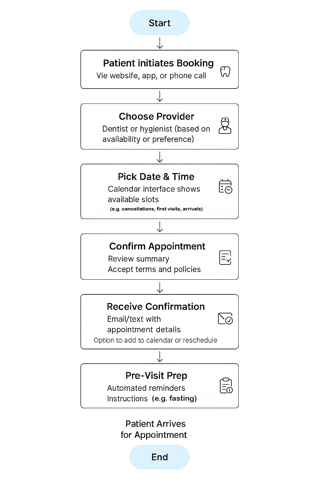
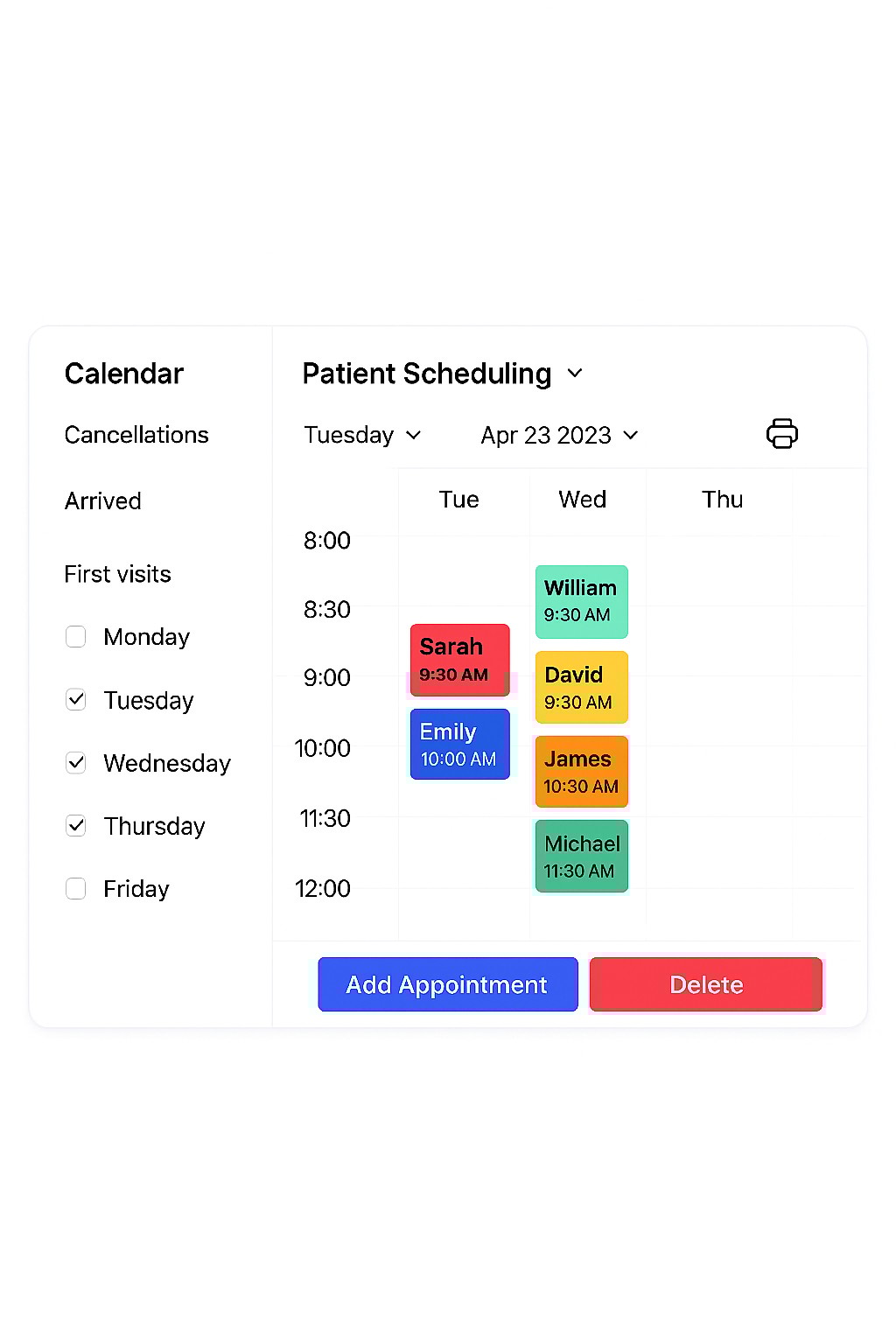
Solution
The redesigned interface introduces a modern, intuitive scheduling experience:
- Clean layout: Simplified calendar grid with clear time slots and day labels
- Consistent styling: Unified typography, button styles, and color-coded appointment blocks
- Improved controls: Streamlined filters and actions (Add, Delete, Print) with icon support
- Accessibility-first design: High contrast, readable fonts, and logical tab order
- Scalable structure: Sidebar filters and weekday checkboxes allow flexible customization
Dentist Patient Scheduler
Problem
Dental offices often rely on outdated scheduling systems that are cluttered, unintuitive, and difficult to navigate.
The original interface suffered from:
- Overcrowded layout with minimal spacing
- Inconsistent color usage without clear meaning
- Redundant or confusing controls (e.g., “DELETE” in all caps)
- Lack of accessibility and visual hierarchy
These issues created friction for front-desk staff, increased the risk of booking errors, and made it harder to manage patient flow efficiently

Analysis
A heuristic evaluation and visual audit revealed several usability violations:
- Visibility of system status: No clear indication of selected filters or active days
- Match between system and real world: Abbreviations like “Tua” confused users
- Consistency and standards: Button styles, labels, and layout lacked uniformity
- Aesthetic and minimalist design: Excessive visual noise and poor spacing
- Accessibility gaps: No support for screen readers, color contrast issues, and unclear focus states
User interviews with dental office staff emphasized the need for:
- A clean, glanceable layout
- Clear day and time indicators
- Easy-to-use controls for adding, editing, and filtering appointment

Solution
The redesigned interface introduces a modern, intuitive scheduling experience:
- Clean layout: Simplified calendar grid with clear time slots and day labels
- Consistent styling: Unified typography, button styles, and color-coded appointment blocks
- Improved controls: Streamlined filters and actions (Add, Delete, Print) with icon support
- Accessibility-first design: High contrast, readable fonts, and logical tab order
- Scalable structure: Sidebar filters and weekday checkboxes allow flexible customization